


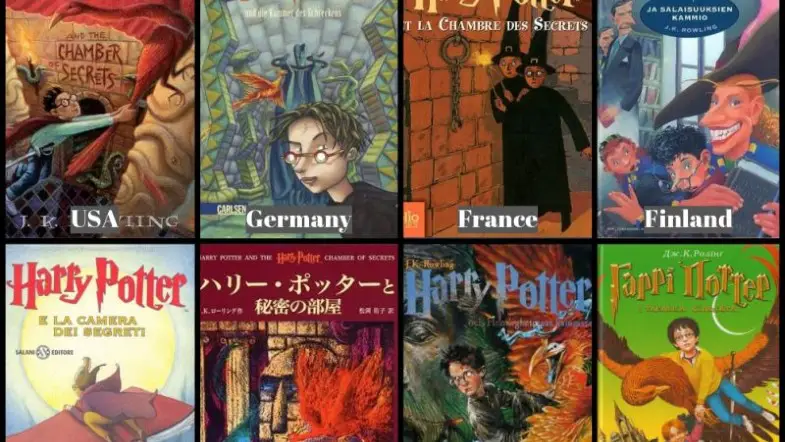
Ready to judge Harry Potter books by their covers? Some of them are great, and some of them are definitely not (what were you thinking, Sweden?), but they’re all worth critiquing.
New USA
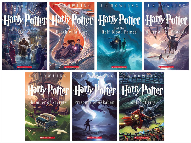
Image via Flipsnack
These are great. We’ve got CREATURES. We’ve got ATMOSPHERE. We’ve got great art—look at that dragon! And it looks like the artist actually had any idea what the books were about. They’re pretty, and I want them.
10/10
New UK

Image via The Washington Post
A very close second! Fewer cool animals though, so it loses a point. The dragon isn’t as good, he looks like he’s about eight on the Deathly Hallows cover, and someone got too excited about hair and beards. There’s also a lot of fire? Same good concept, but very different energy.
9/10
Classic US
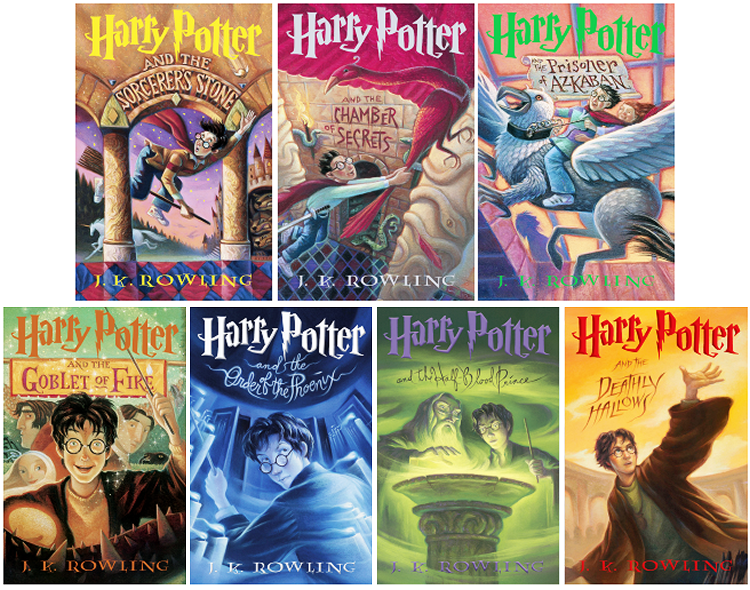
Image via Goodreads
It’s good, but it’s not great. These are the covers I grew up with, so I might be biased, but I like the strong color choices, especially in the later books, and the faces look pretty normal. Hermione does have red hair for some reason, which is the worst, but overall decent.
7/10
Swedish
Image via Reddit
These have a real grim vibe, but I dig it. The thestrel looks like a nightmare, the dragon is fierce in stead of cute, and that ring of ghosts is pretty alarming. Harry also looks his age on all of them. Some of them are just ok though, and Dumbledore could be cooler.
6/10
New 20th Anniversary
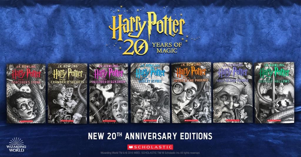
Image via Bustle
Why would you make this? They’re overworked and creepy, and I don’t have any idea why you’d use black and white, the design is weird, not everyone’s face needs to be on every book. Harry looks like seven different people. Dumbledore is the worst.
3/10
Original UK

Image via Flipsnack
I’m sorry, but the illustration style is condescending and the faces are bad. And does harry have a spray tan on the last cover? The hyippogryph is pretty cool, but the dragon is terrible and the phoenix is so so. Sorry people who grew up with these, but they’re no good.
3/10
Danish

Chasing the Turtle
These are terrible, obviously, but in a surprisingly retro way? This looks like a bad fantasy or sci-fi cover from the sixties or something. Like, it’s not WEIRD MAGIC BOOKS for WEIRD PEOPLE, it’s Harry Potter. Why would you do this to yourselves? And is that photo harry on an illustrated background in the first one? Yikes.
2/10
German
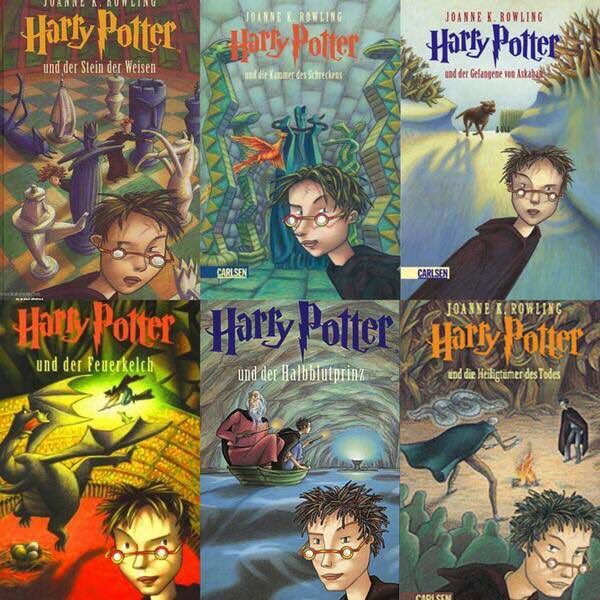
Books, Writing, and Other Things
What is this. Those glasses aren’t in front of his eyes. I don’t understand the attitude. I don’t understand the frosted tips. These look like ebook exclusives I wouldn’t buy. My eyes are angry. And why is he just sort of leaning into every frame? Thanks. I hate it.
0/10
Bookstr is community supported. If you enjoy Bookstr’s articles, quizzes, graphics and videos, please join our Patreon to support our writers and creators or donate to our Paypal and help Bookstr to keep supporting the book loving community.
Become a Patron!